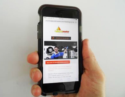
Today there are more people using mobile devices such as phones and tablets to search online, than there are people searching on PCs. To improve the user-experience for customers using their mobile devices to view our website (and use our online forms) Pryors website is now fully mobile responsive. Basically this means that all the pictures and text are re-ordered automatically, to suit the viewers screen size. Check it out sometime on your smart phone or tablet.